“You do know more about color than you think. The same principles you use to coordinate dress, shoes, hat, gloves, and accessories are easy and fun to apply to color in your home.”
how were people using color in 1961?
While styles have changed dramatically, this Better Homes and Gardens book on decor is still amazingly relevant today. That’s because color advice based on scientific principles is timeless.
The chapter on color is pretty lengthy, so I’ll just show a few specific sections for our purposes.
On facing pages, they include a color wheel – quite helpful.
I I 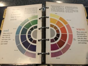 tI
tI
I also like how they use an analogy between choosing an outfit and decorating a room with color and pattern. (see quote above in purple)
This is something I also say to my customers: It’s easy to get overwhelmed with color choices, especially for a new build or a big renovation. Just remember, you already have a basic knowledge of how to mix color and pattern. You do it regularly when you select an outfit. Those same skills can be applied to your home…. and with the assistance of a trained color specialist, you’ll be able to make decisions with even more confidence.
developing color schemes from the wheel
The book goes on to describe the three basic color schemes:
Monochromatic – variations of light and dark hues within the same color family. For example, pale green to emerald green, or brown, beige and cream.
Analagous – color families that are next to each other on the color wheel also form harmonious combinations. Blue-green, green and yellow is one example.
Complementary – a pair of colors that are opposite each other on the wheel, such as yellow and blue-violet. Turquoise with red-orange was a popular Mid-Century color combo that also used complementary colors.
They include examples of both warm and cool color schemes, and discuss how they give the room a different feel.
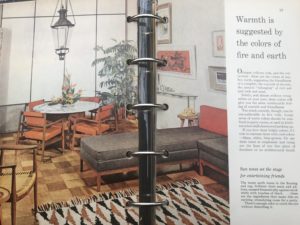
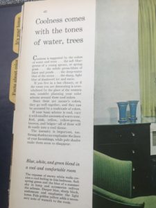
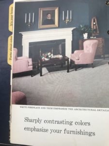
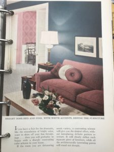
With the exception of a few small accent pieces, many of the interiors featured in the book
could be taken for a contemporary design.
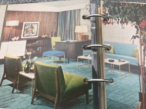
Especially interesting is this room from 1961 with dark navy walls and blush pink accents. This has been a popular color combo for several years, and will remain a strong trend in 2020. Another reminder that while nothing stays “in” forever, certain color trends tend to repeat.